


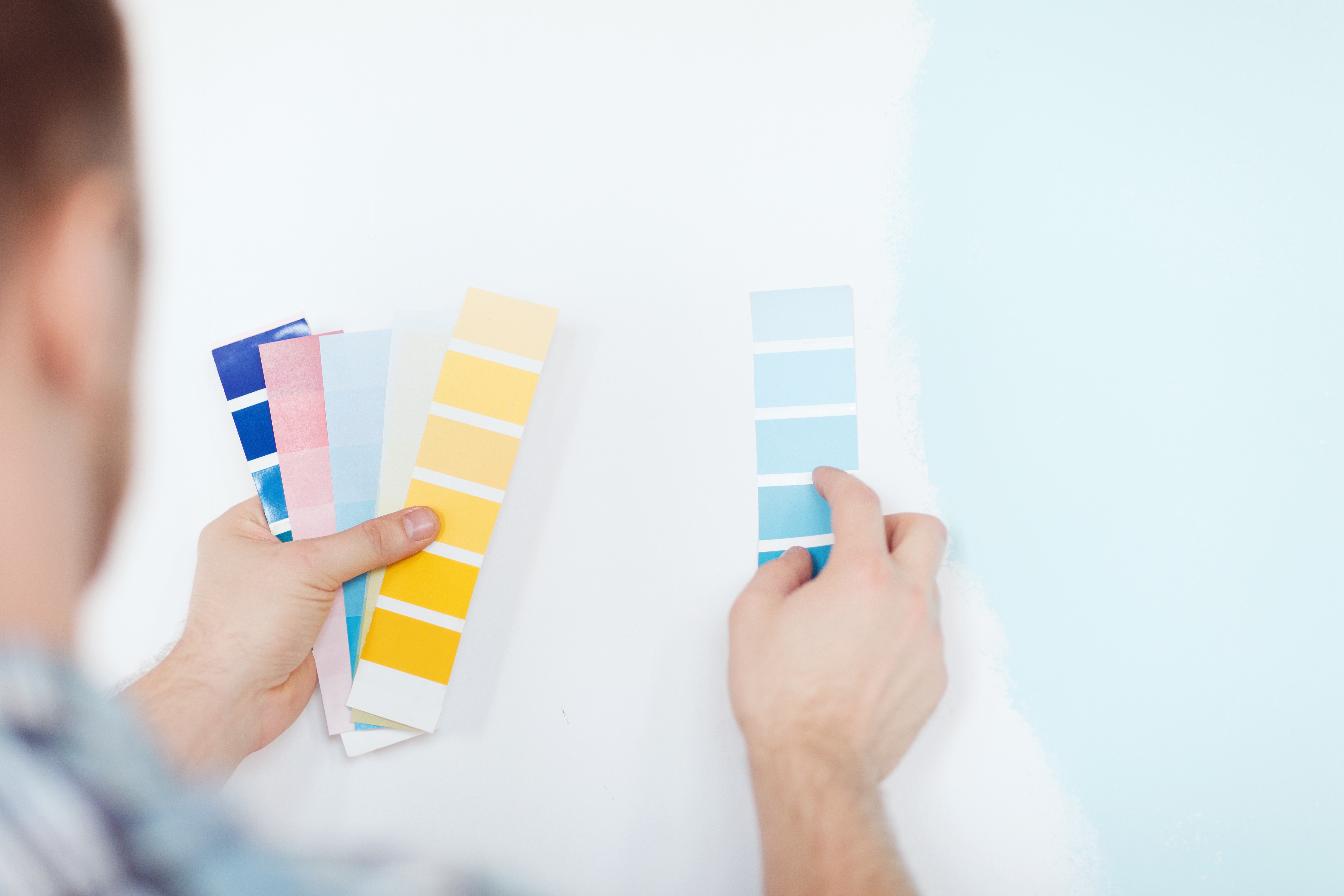
How our home looks is a reflection of our personality. Interior design trends are as big as fashion trends and owner-occupiers and landlords follow these to emulate the look at their property. Long gone are the days were painting a wall white will do.
Whilst white walls suit bathrooms and separate kitchens that need repainting more often than other rooms due to their usage, elsewhere this colour are considered a bit bland.
Recent trends have veered towards darker and deeper colours. Dark navy blue, teals, forest greens and even greys are recent colour tones that have become a hit. These darker shades ooze sophistication and also mean that the rest of the room needs minimal other accessories rather than a white wall which is considered to be a blank canvas for other items to be added to.

For anyone going down this route, the application of these colours needs to be accurate. These hues create a significant contrast against a white ceiling so lines need to be straight to perfect the look. An untidy finish will create an entirely different look.
Whilst colour can be quite personal, it will make a buy-to-let property stand out against the competition. Plus the colour will add character without the need for extra accessories which can be costly to replace or to maintain during tenancies.
Property investors need to achieve a balance between finding a look that appeals to a wide pool of potential tenants, and not creating something too boring. Rental properties have really improved in quality over the years and tenant expectations have increased too.
Should you not be feeling brave enough to add these deep hues to your rental property, then opt for an off white in a grey shade instead. This will immediately make space feel more contemporary than just white walls.
Another on-trend colour is lighter and coral pinks. The tone needs to be just right though to avoid a sickly look. This shade will work well in the darkroom needing light, whereas darker shades suit the bedroom to create a dark sleeping environment to promote rest. Here a dark blue works well and is a shade that can easily work with a variety of other existing colour palettes in the room.
Lastly, if this feels like a bold move why not paint one room instead and give it a trial run? That way you can ease yourself in slowly and add more colour at a later date.
Read more insights about Bangkok property market and home tips, check out DDproperty Property Index Report, DDproperty Property Market Outlook Report and Property guides
Disclaimer: The information is provided for general information only. DDproperty by PropertyGuru c/o AllProperty Media Co., Ltd. makes no representations or warranties in relation to the information, including but not limited to any representation or warranty as to the fitness for any particular purpose of the information to the fullest extent permitted by law. While every effort has been made to ensure that the information provided in this article is accurate, reliable, and complete as of the time of writing, the information provided in this article should not be relied upon to make any financial, investment, real estate or legal decisions. Additionally, the information should not substitute advice from a trained professional who can take into account your personal facts and circumstances, and we accept no liability if you use the information to form decisions.